
V&A Visit (Room 101)
This week’s exhibition visit brought me to the Victoria and Albert Museum to visit the 1940s-Now portion of the photography collection; an area of the museum I’ve never visited before. Two separate works that were next to one another caught my eye more than anything in the room. The first image that attracted me was, Santu Mofokeng “Christmas Church Service, Mautse Cave”, 2000. Considering the image was part of Mofokeng’s series, Chasing Shadows, I was struck by his use of black and white in the image. The work is described as being based on exploring landscapes holding spiritual energy/religious procession throughout South Africa. What appears as a striking cave, with a large wave-like, curved wall. and an ambiguous religious figure is deprived completely of color. The entire scene is captured using a high aperture as everything is in focus. There is a clear use of line that sculpts the entire image. While the title is intended to represent the chase for understand the spiritual/unknown I can’t help but feel as if there is also some sort of connection between the title and Mofokeng’s use of black and white. Analyzing the distinct choice to decolorize the scene, my first thought is that Mofokeng did so in order to further distort the viewers perception. The image captures a terrain that is foreign enough to the human eye that by stripping it of its color too, it becomes difficult to even ascertain what you, the viewer, are looking at when you first glance at it. It could just as easily be taken from a science fiction film, and that’s the beauty of it.
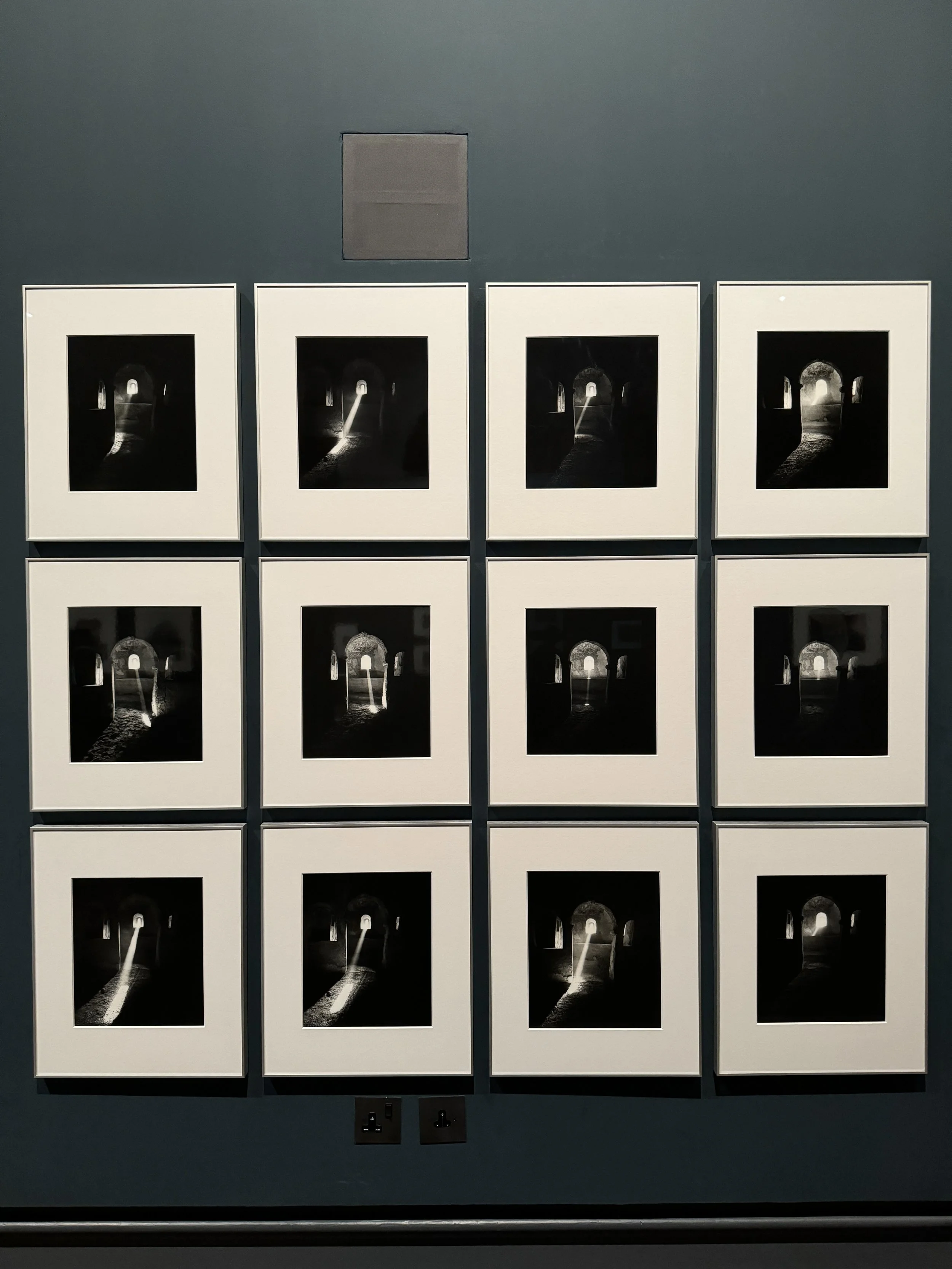
The second work I looked at was the series, Ursula Schulz-Dornburg, Sonnenstand, 1992. The title translates to “position of the sun.” This series photographs the same window at different times throughout the day documenting the change in the sunlight’s position– hence the title. The sequencing is entirely joined together through the passing of time. While the blurb focuses more on Schulz-Dornburg’s concern with architecture and religion, the series delivers an impactful narration on time too. Through the evolution of the images, despite being in a nearly entirely dark room without any sense of the outside world, there is a noticeable sense of time passing as the sunlight shifts. The photos in the series are all backlit by the light coming through the window. This movement is enhanced by two compositional elements: color and angle. The consistent angle employed throughout this series not only creates an emphasis on the window itself, but its fixed position is what is able to convey the sense of time passing in the first place. Without the fixed angle, the movement of the sunlight would become obsolete as our eyes wouldn’t be able to track it in reference to its origin. The black and white color further enhances the passing of time by emphasizing the beam of sunlight peering through the window. Despite the different times these photos have been taken throughout the years, every photo consistently features more black, nebulous space than that which the light occupies– directly connecting to the darkness and its affect on the monks, which originally interested the photographer. Overall, There are so many facets at play. One could spend their time thinking only about the passing of time, while it’s arguably just as easy to ponder the battle between light and dark in this image, and the meditative lives of the monks that live in these hermitages.
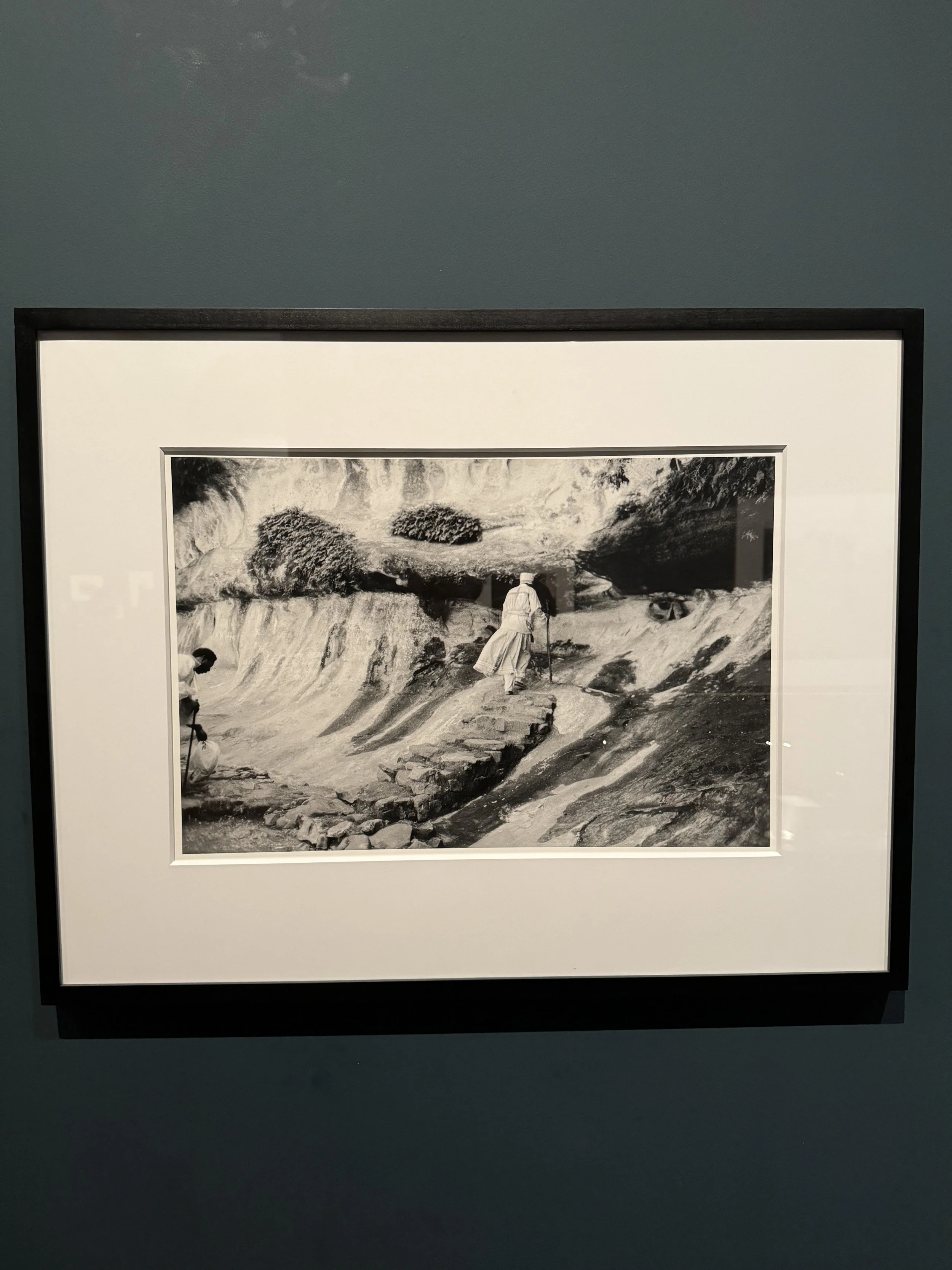
Santu Mofokeng, Christmas Church Service (Mautse Cave), 2000
Both Photos:
Ursula Schulz-Dornburg, Sonnenstand (Position of the Sun), 1992
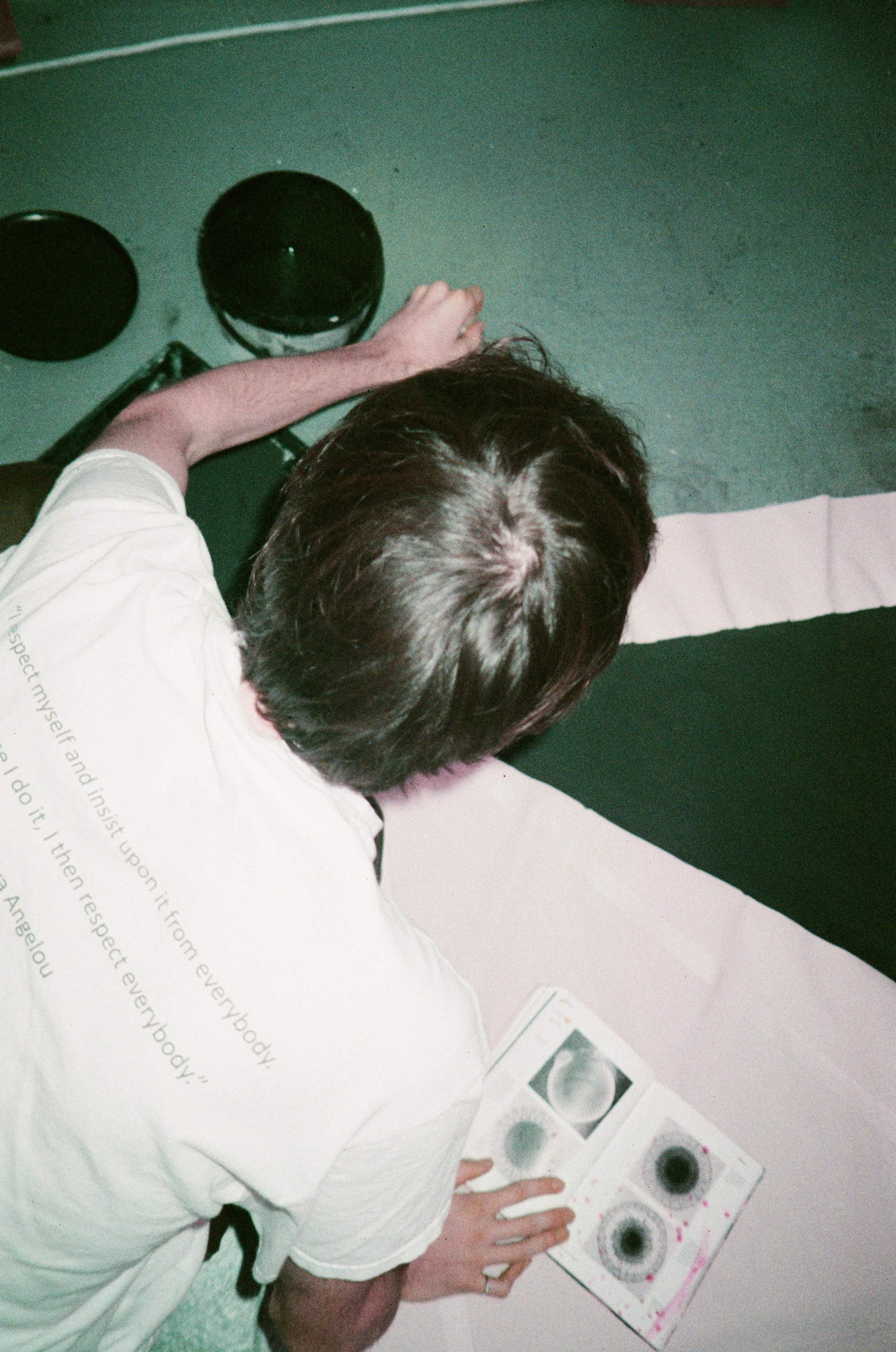
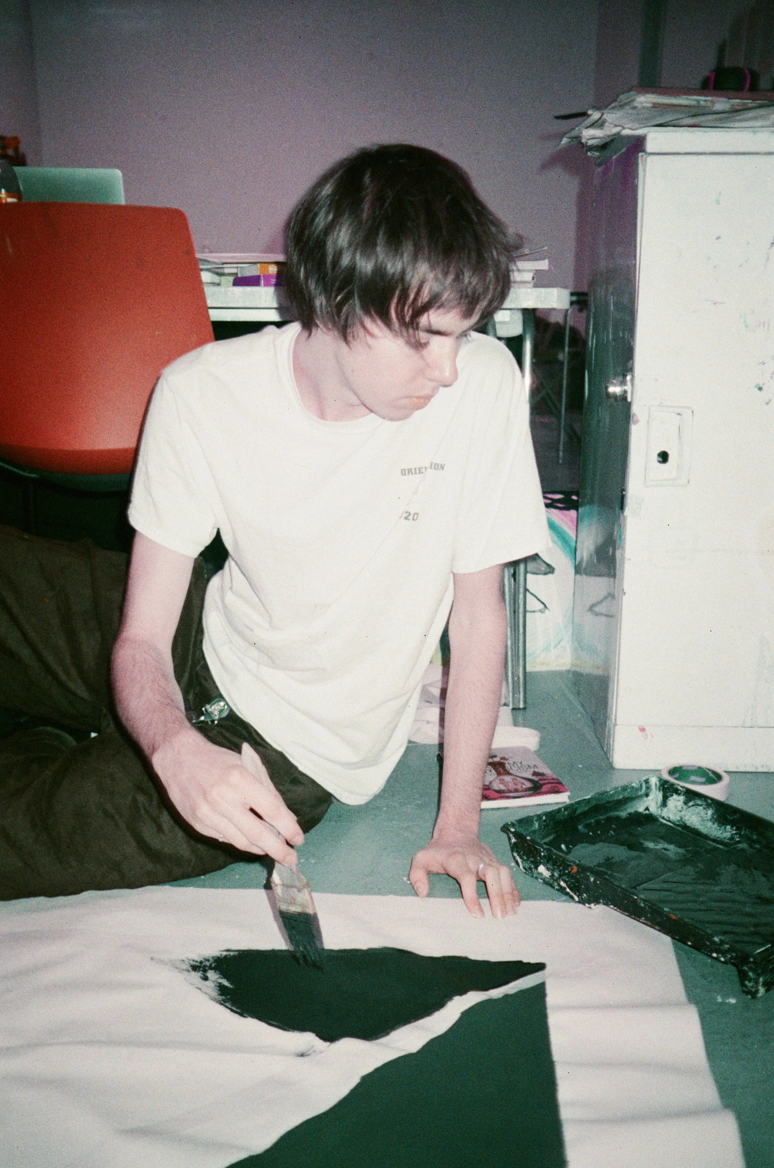
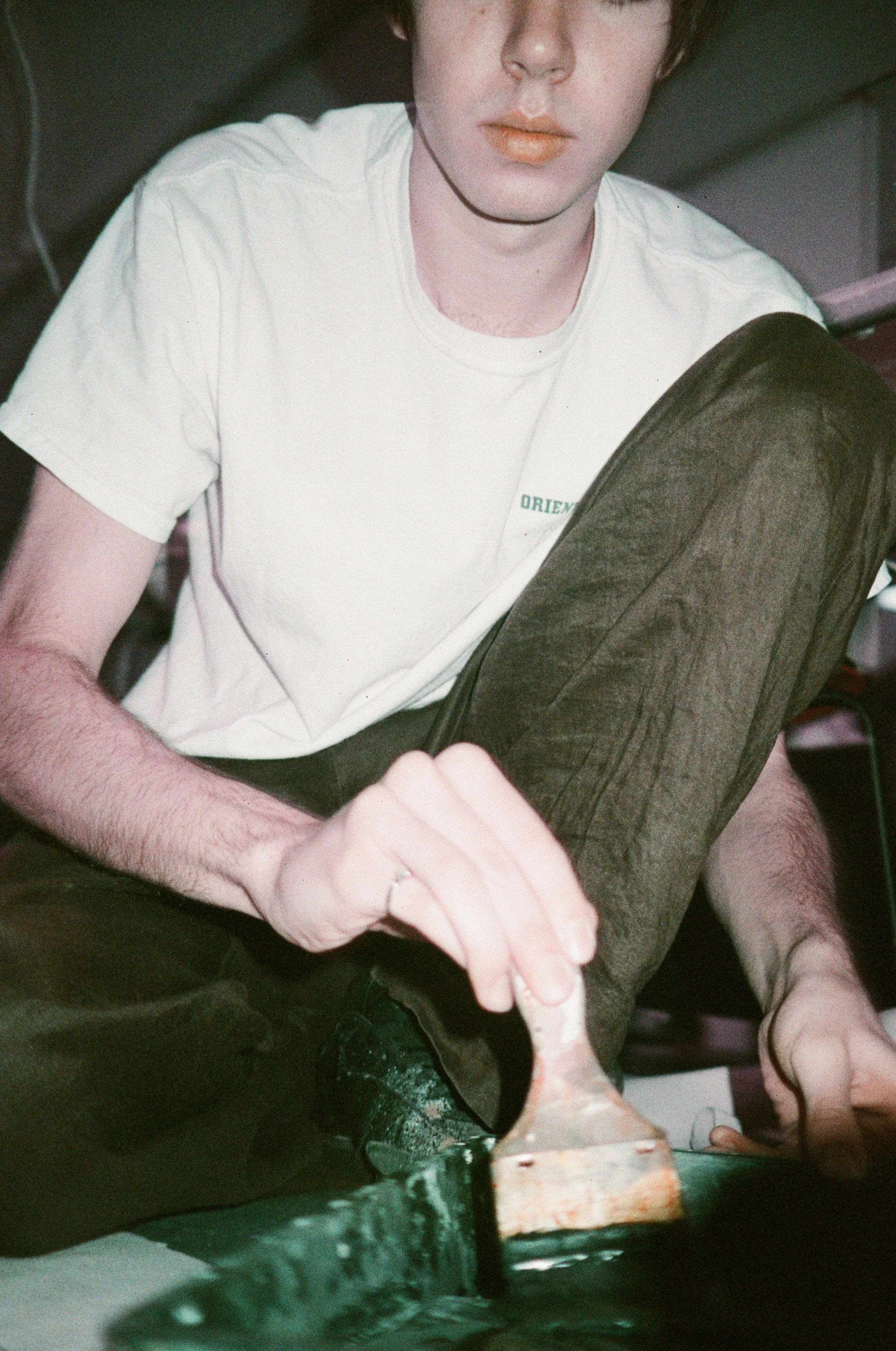
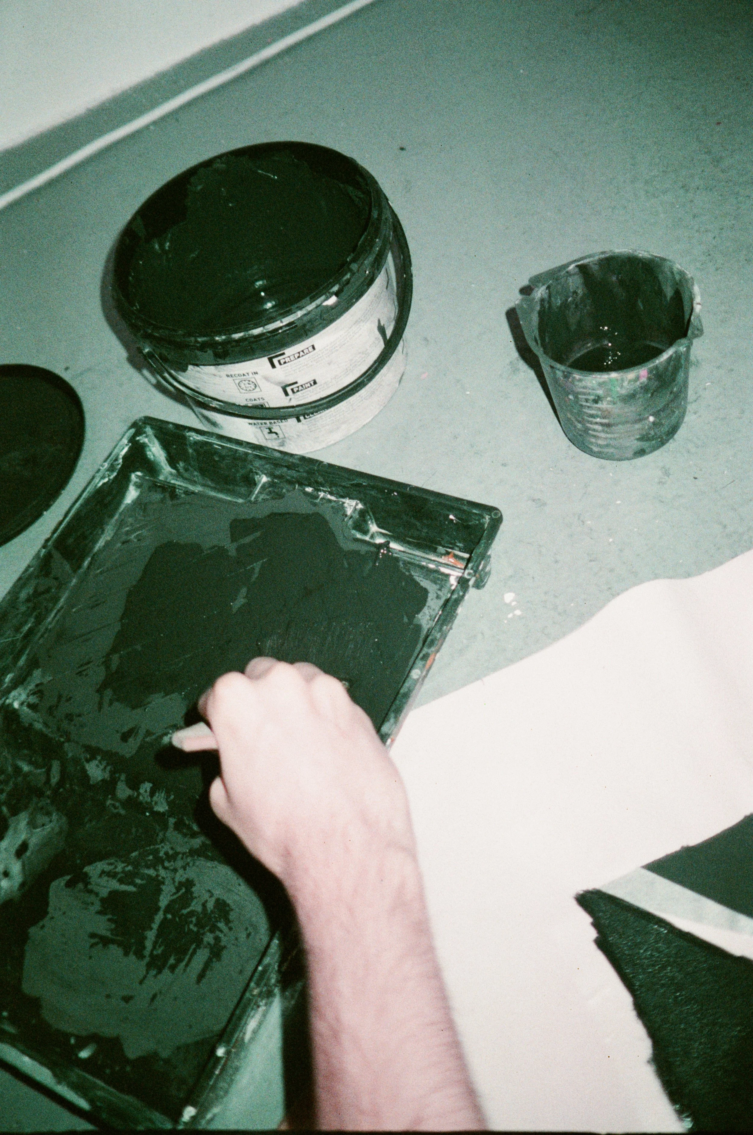
For my portrait series I shot my friend, Gordon, in his art studio in UAL’s campus. While there where other angles I enjoyed more, these four shots felt most aligned with the mandated portrait angles. My plan for the photos was simple, keep Gordon in the same place painting a section of his canvas. The first image is the overhead portrait. This shot places the subject in a position where one can almost see a method to the madness. There’s a clear relation between Gordon, his canvas, his paint, and his book of research; as if you are peering into the world he is actively creating. This angle is far more 3rd person than the rest as there is no emotion to grasp. All one can see of the subject is the back of their head, the objects around him are what influences the viewers perception. The second shot of Gordon is eye level. While Gordon doesn’t make eye contact, the viewers perception is still much more focused around his face; it is human nature to do so. There is not a whole lot to discern from Gordon’s face, he could be pensive. maybe focused; I don’t know. I quite like this composition as you see the curves of Gordon’s seated position clashing with the rigidity of the lines he is painting. Despite being eye level he still seems unaware that the camera is there– a position that was his decision. The third shot is from the angle below Gordon. While power is what instantly comes to mind with a shot like this, I think the product of this angle is a bit more unconventional than that. Power often comes from eye contact and body language, yet much of that is deleted through the exclusion of Gordon’s eyes in this shot. Instead there is more of a focus on his technique–how he holds the paintbrush, the way in which he sits– this angle enhances those tiny details. It puts us, the viewer, in a position once again that we are inside of his world, seeing his creative nature in live time. The final shot is from Gordon’s point of view. This shot is meant to display the simple action of painting while underscoring the ingenuity and thriftiness that is often required of struggling artists. Though subtle, the bucket of paint is a wall paint meant for houses; the cheapest in the store. Furthermore, every bucket or brush pictured is enhanced by the stains of tens of students that used it before gordon; a patina of student artist struggles. This is one thing that struck me from my time with Gordon, everyone talks of the “starving artist” trope, yet how many of us actually consider the ungodly amount of art supplies one needs to purchase in order to be a student producing fully fleshed out works. I was really taken aback that Gordon has to purchase every single item he creates with, despite paying a full tuition to his school, where he only meets a tutor for one session a week and spends the rest of his time creating and researching individually. This series seems most cohesive due to its unique use of color thanks to the Lomography Purple 35mm film I used. Most photos were taken between F8 and F2.8.